Pantone Colors in the Cosmetics Industry: A Complete Guide from Color Trends to Product Development
Discover how Pantone colors influence cosmetic packaging, makeup brush manufacturing, and brand consistency. Learn practical color matching techniques with the 2025 Pantone Color of the Year Mocha Mousse and the 2026 trend color Cloud Dancer.
Color is one of the most powerful marketing tools in the beauty industry. Long before consumers experience the formula inside a product, they form an impression based on its appearance. Packaging color, makeup brush handles, cosmetic cases, and gift boxes all contribute to how a brand is perceived.
Behind this visual consistency lies one essential standard — the Pantone Matching System (PMS).
Pantone provides a universal color language that allows designers, manufacturers, printers, and suppliers around the world to reproduce colors accurately across different materials and production facilities.
Whether you're developing a premium makeup brush collection, launching a seasonal cosmetics line, or refreshing your brand identity, understanding Pantone colors is essential.
In this guide, we'll explore how Pantone is used throughout the cosmetics industry, review two influential trend colors — Pantone 17-1230 Mocha Mousse and Pantone 11-4201 Cloud Dancer — and share practical tips for achieving consistent color production.
Why Pantone Matters in Cosmetics Manufacturing
Unlike RGB or CMYK colors, Pantone colors are standardized physical references. This allows every supplier involved in a project to work toward exactly the same target color.
For beauty brands, Pantone helps ensure consistency across:
- Cosmetic packaging
- Makeup brush handles
- Plastic and aluminum components
- Printed paper boxes
- Gift packaging
- Retail displays
- Marketing materials
Without a Pantone standard, identical colors can appear noticeably different between suppliers or production batches.
Pantone Color Trend Overview
Pantone 17-1230 Mocha Mousse (2025)
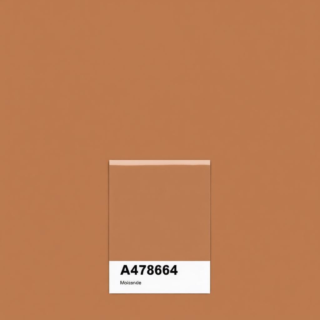
Mocha Mousse is a warm, elegant brown inspired by coffee, chocolate, and natural earth tones.
It represents:
- Quiet luxury
- Comfort and warmth
- Sustainability
- Premium craftsmanship
- Timeless elegance
For cosmetic brands, this color pairs exceptionally well with matte finishes, wood textures, champagne gold accents, and soft-touch coatings.
Pantone 11-4201 Cloud Dancer (2026)
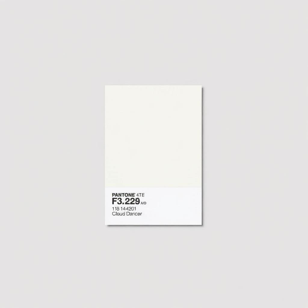
Cloud Dancer is a clean, airy white that reflects simplicity and purity.
It aligns perfectly with growing beauty trends such as:
- Clean Beauty
- Minimalist Packaging
- Clinical Luxury
- Scandinavian Design
- Sustainable Beauty
Cloud Dancer creates an elegant foundation that works beautifully with silver, pearl finishes, and transparent packaging.
How Pantone Colors Are Used in Cosmetics
1. Cosmetic Packaging
Packaging is the first physical interaction customers have with your brand.
Using Pantone spot colors ensures that:
- Every production run maintains identical colors.
- Packaging remains consistent across different printing facilities.
- Products display uniformly on retail shelves.
- Brand recognition improves over time.
Example: Mocha Mousse Packaging
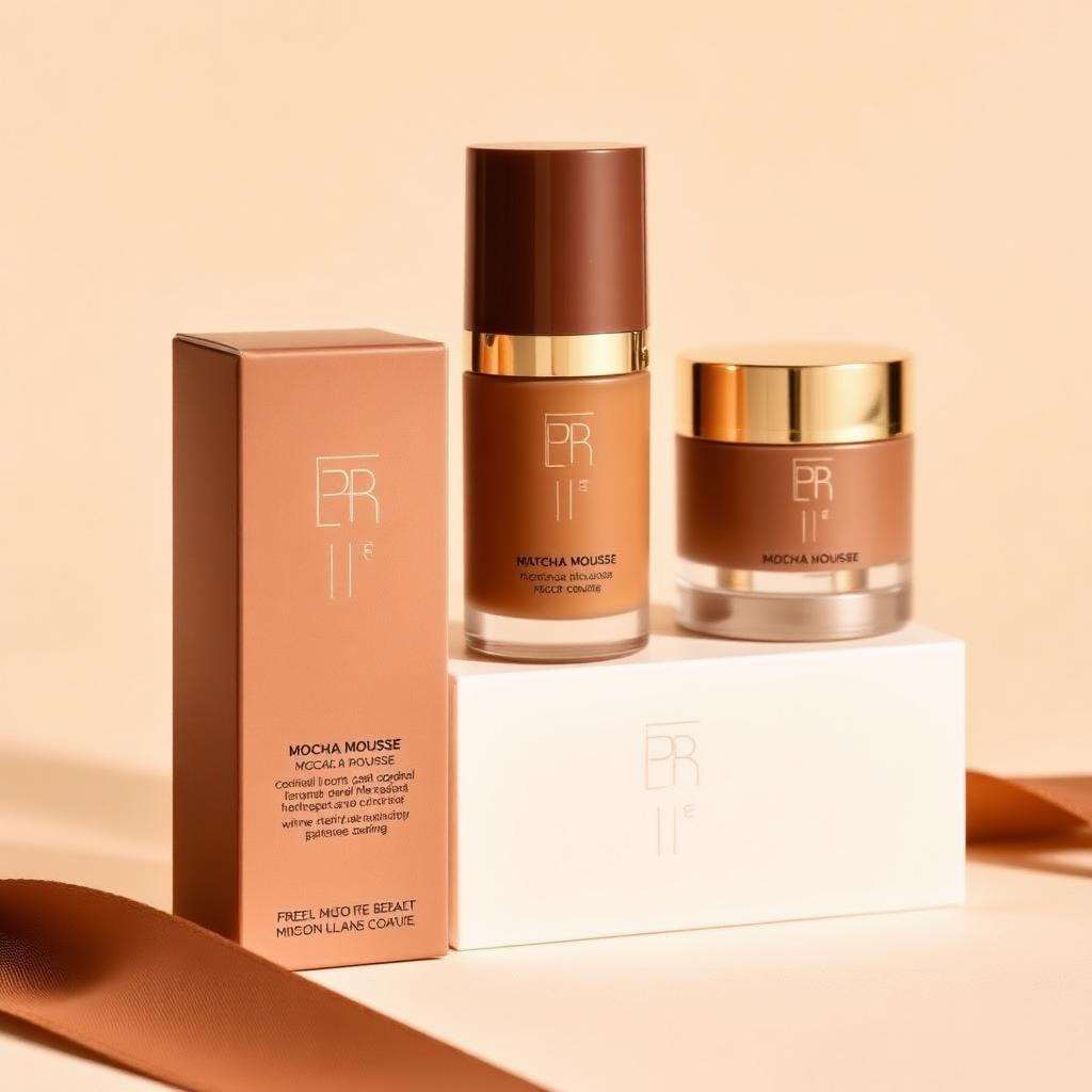
This warm brown creates an upscale, earthy appearance ideal for:
- Foundation collections
- Makeup brush gift sets
- Luxury skincare
- Sustainable beauty brands
Example: Cloud Dancer Packaging
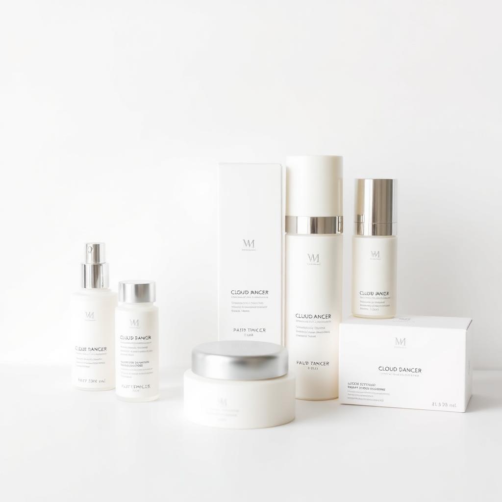
Cloud Dancer delivers a premium minimalist aesthetic suitable for:
- Professional skincare
- Clean beauty
- Dermatologist-developed products
- Luxury cosmetic accessories
2. Makeup Brush Handles
Color consistency becomes even more important when manufacturing makeup brushes.
Unlike printed packaging, brush handles involve multiple production processes, including:
- Injection molding
- Spray painting
- UV coating
- Soft-touch finishing
- Metallic coating
- Silk-screen printing
- Hot stamping
Each process affects the final appearance of a Pantone color.
Mocha Mousse Makeup Brush Handle
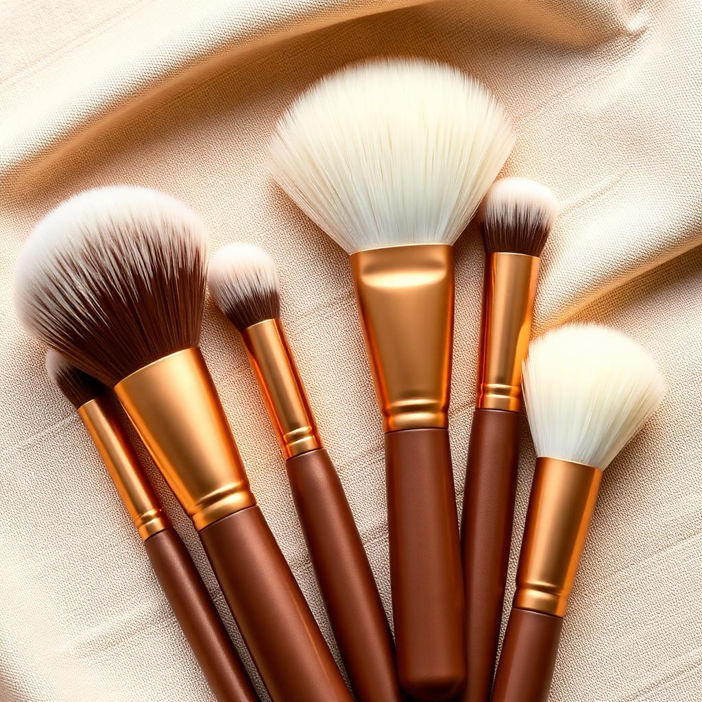
Mocha Mousse creates a sophisticated, luxurious appearance when paired with:
- Matte champagne ferrules
- Walnut wood textures
- White synthetic bristles
- Satin finishes
Cloud Dancer Makeup Brush Handle
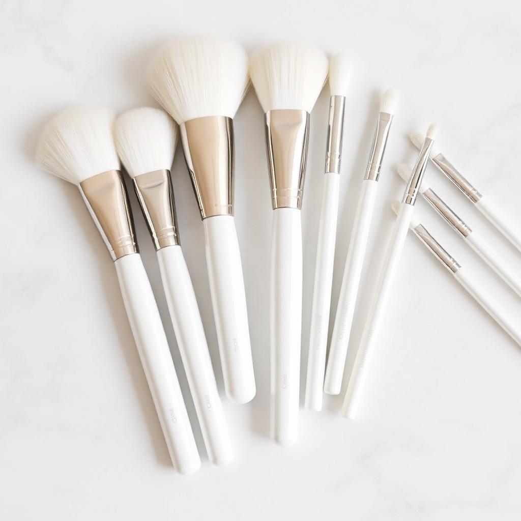
Cloud Dancer delivers a clean, premium appearance when combined with:
- Pearl white handles
- Silver aluminum ferrules
- White synthetic bristles
- UV gloss coating
This combination is especially popular among skincare brands and luxury cosmetic collections.
3. Complete Product Collection Color Matching
Leading beauty brands rarely apply Pantone colors to just one component.
Instead, they create a unified visual identity by matching colors across:
- Outer packaging
- Makeup brush handles
- Cosmetic bags
- Gift boxes
- Display trays
- Retail presentation
This consistency enhances perceived quality and strengthens brand recognition.
Best Practices for Accurate Pantone Color Matching
Always Produce Physical Samples. Digital screens cannot accurately represent real production colors. Before mass production, manufacturers should prepare physical samples under standardized lighting conditions.
Consider Surface Finishes. The same Pantone color can appear different depending on the finish. Examples include: matte, gloss, soft-touch, metallic, pearl, frosted, and rubber coating. Cloud Dancer is particularly sensitive to finish variations and requires tighter quality control.
Use a Unified Color Strategy. Rather than selecting colors independently, develop a complete color system covering packaging, makeup brushes, cosmetic tools, accessories, and marketing materials. This creates a more premium and cohesive brand image.
Balance Cost and Visual Impact. Pantone spot colors generally cost more than standard CMYK printing. A practical solution is to use Pantone colors on key visual elements while applying process colors to secondary graphics, balancing quality with production costs.
Common Challenges in Cosmetic Color Matching
Manufacturers often encounter:
- Material-to-material color variation
- Different paint suppliers
- Plastic batch inconsistencies
- Lighting condition differences
- Surface texture effects
- Metallic coating variations
Working with experienced OEM manufacturers significantly reduces these risks through standardized quality control and professional color management.
Conclusion
Pantone is much more than a collection of color numbers — it is the foundation of color consistency throughout the cosmetics industry.
From luxury packaging to makeup brush handles, every carefully matched color reinforces your brand identity and communicates quality before customers even use the product.
Whether you're launching a limited-edition collection inspired by the latest Pantone trend or building a long-term signature color system, investing in accurate color matching will help your products stand out in an increasingly competitive beauty market.
Bring Your Pantone Colors to Life with Malena
At Malena, we specialize in OEM and ODM makeup brush manufacturing with professional Pantone color matching for:
- Makeup brush handles
- Ferrules
- Cosmetic packaging
- Beauty accessories
- Gift boxes
- Complete beauty collections
Our experienced sampling team ensures consistent color reproduction from concept through mass production, helping beauty brands achieve premium visual quality across every product.
Ready to develop your next beauty collection? Contact Malena today to request samples and receive a customized quotation.
Need a tailored quote?
23+ years of OEM experience since 2003, MOQ from 500, free 3D mockup within 24 hours.
Talk to our team